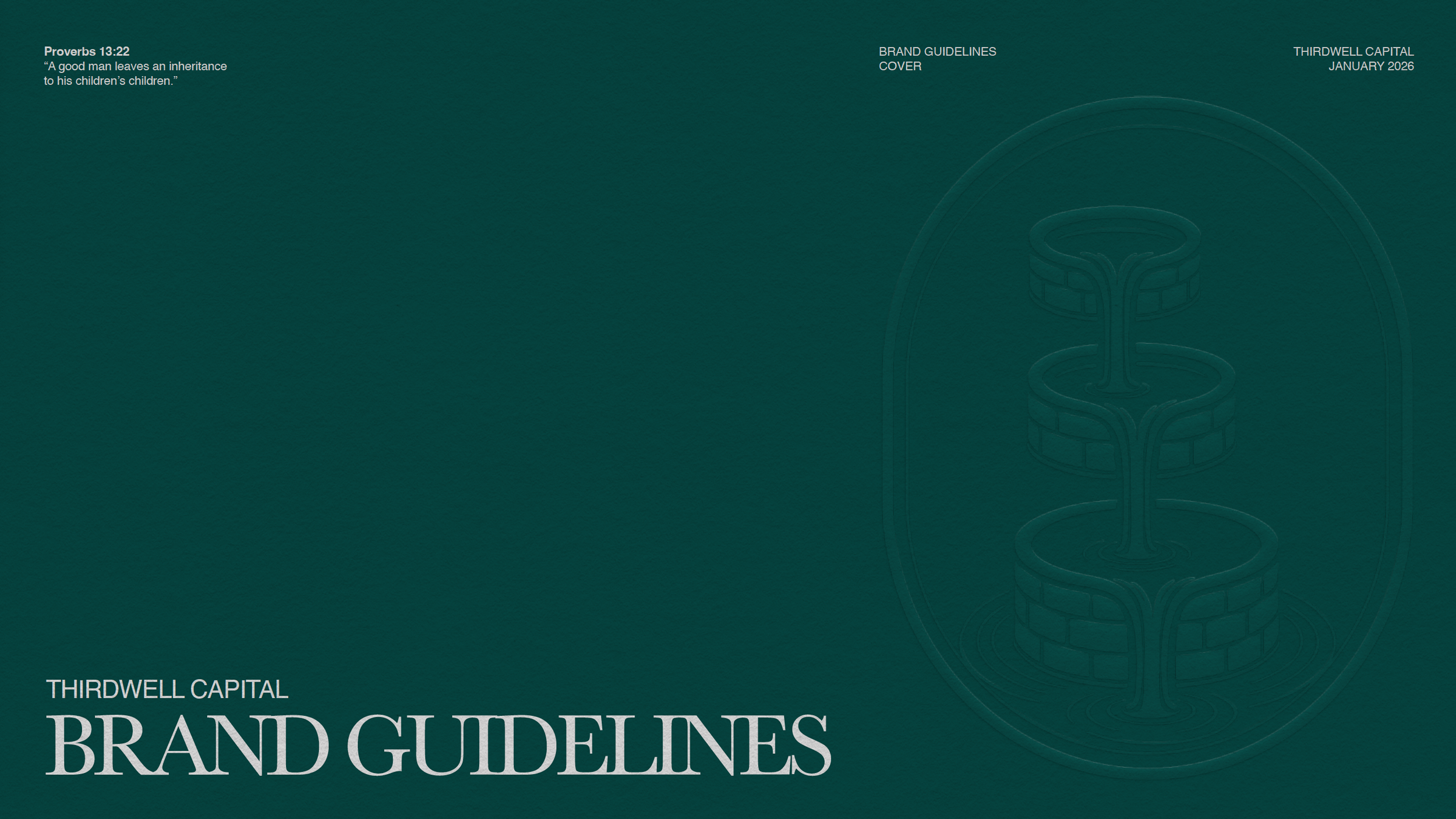
THIRDWELL CAPITAL
Brand Identity System

Our Task
ThirdWell Capital engaged Mindcraft to create a distinctive brand identity that could clearly articulate its philosophy of wealth stewardship, generational responsibility, and faith-informed values—without feeling exclusionary or dated.
The goal was not simply to design a logo, but to build a complete brand system that would feel timeless, refined, and trustworthy across every touchpoint, from digital experiences to printed materials and long-term client communications.
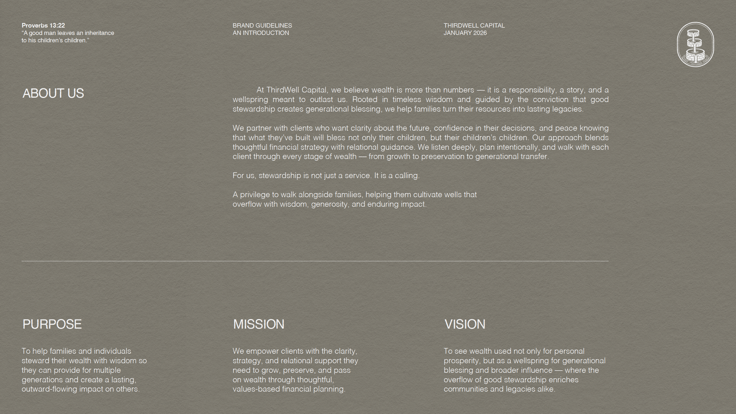
At the core of the task was translating an abstract belief—that wealth is entrusted, not merely accumulated—into a visual and verbal language capable of carrying that meaning consistently for decades.
Our Strategy
We began by collaboratively brainstorming our way into a single, unifying metaphor: the well. Historically a symbol of provision, wisdom, and continuity, the well provided a powerful foundation for expressing ThirdWell Capital’s multigenerational focus and stewardship mindset.
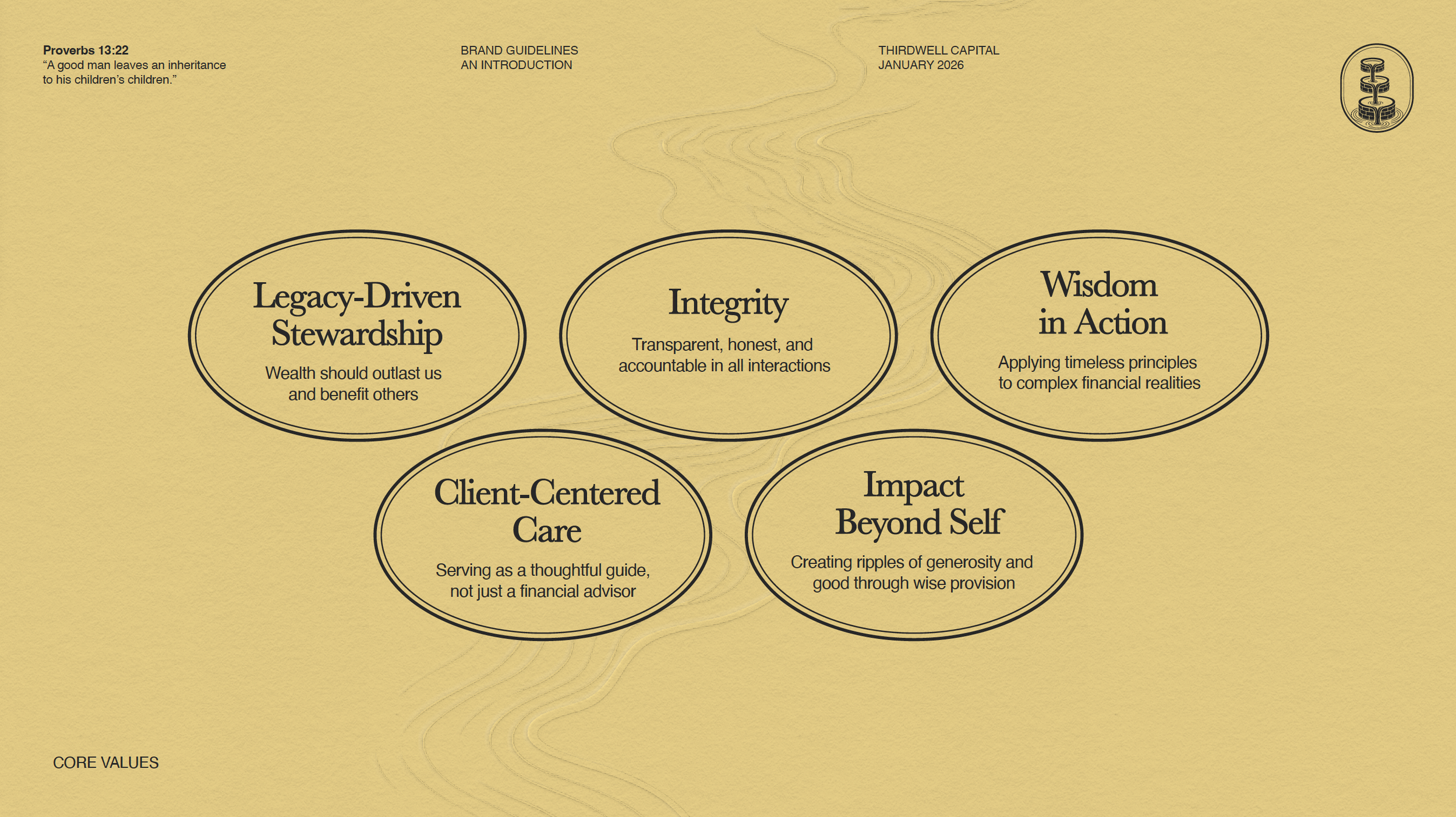
From there, our strategy focused on three guiding principles:
Heritage without nostalgia – A brand rooted in timeless values, but expressed through a clean, contemporary system
Clarity through structure – Visual restraint, consistent frameworks, and disciplined usage rules to reinforce trust
Meaning at every level – Ensuring that typography, color, iconography, and design elements all reinforced the same core story
This strategic lens allowed the brand to communicate depth and credibility quietly, without relying on overt financial clichés or trend-driven aesthetics.
Our Approach
Mindcraft developed a comprehensive brand system designed to function as both a creative foundation and a practical operational tool.
Key components included:
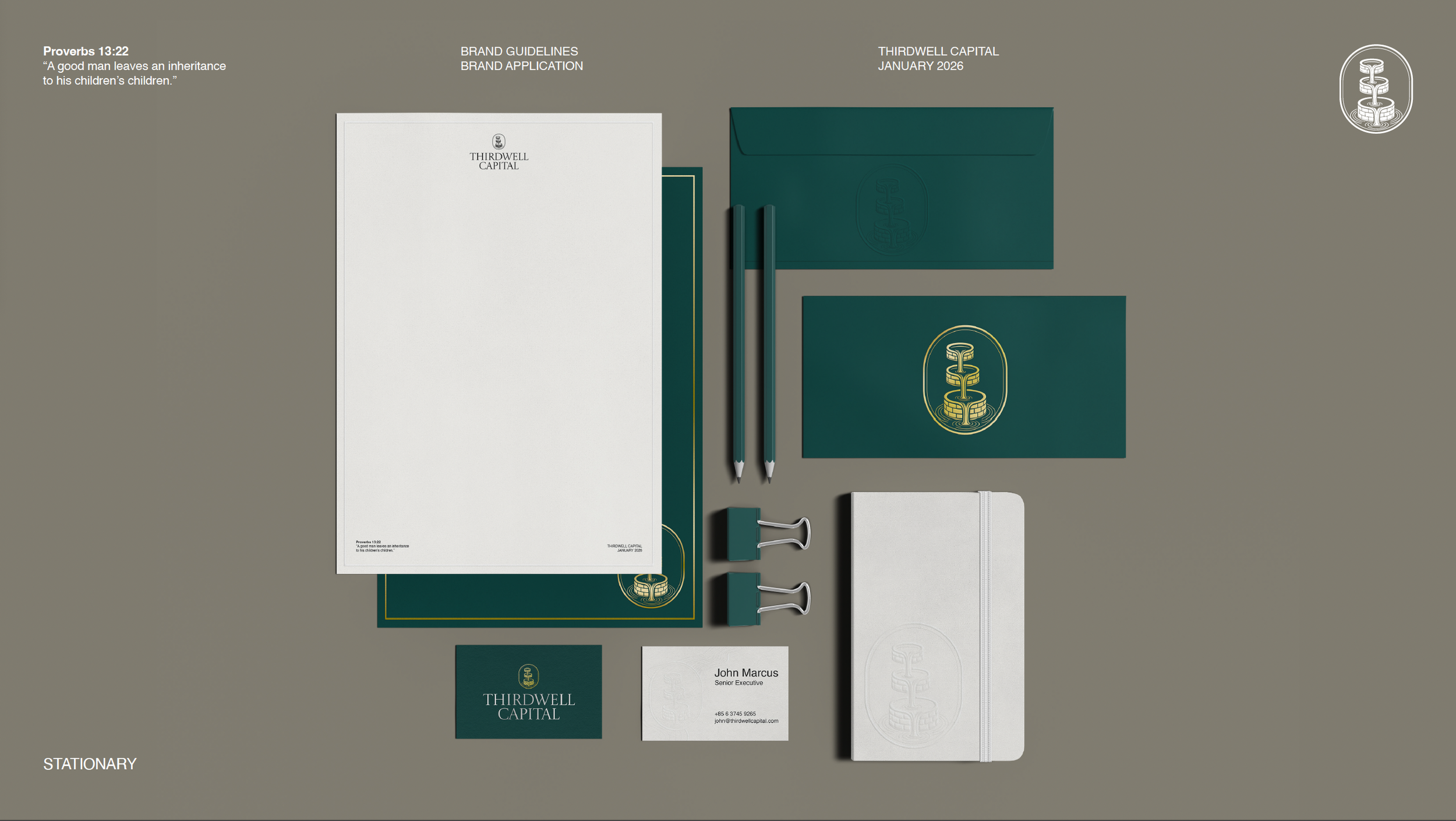
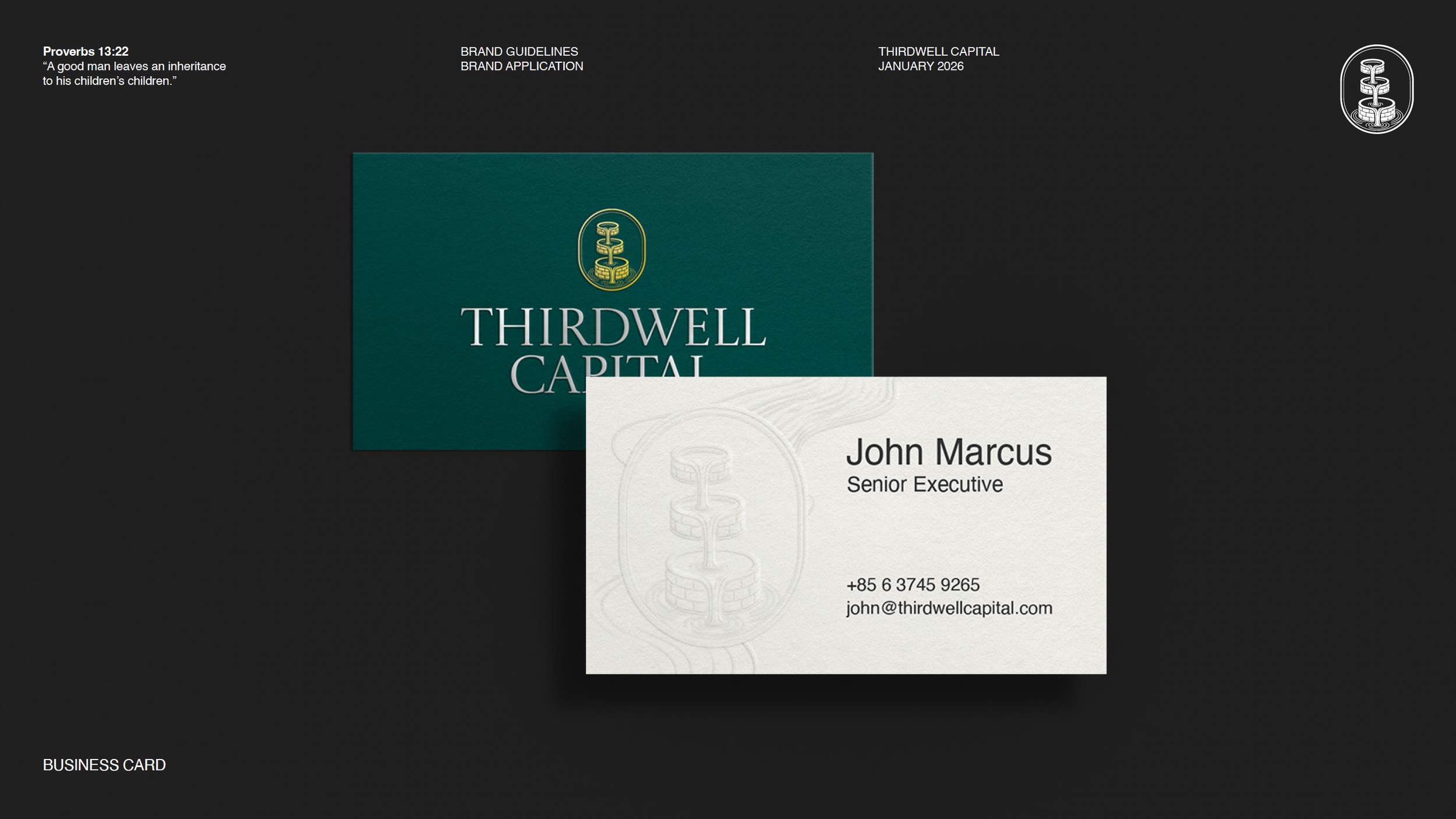
Logosystem
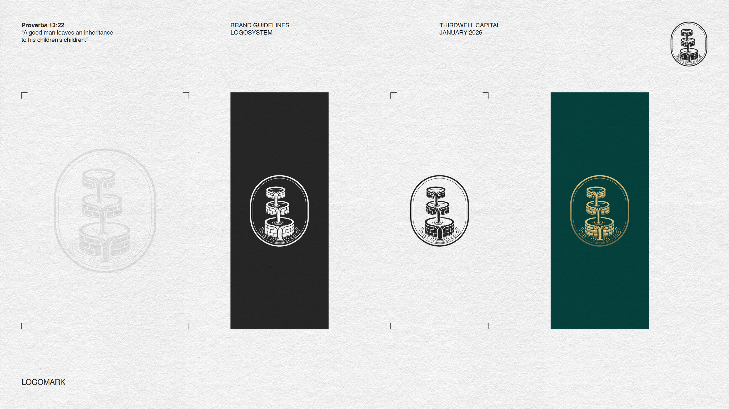
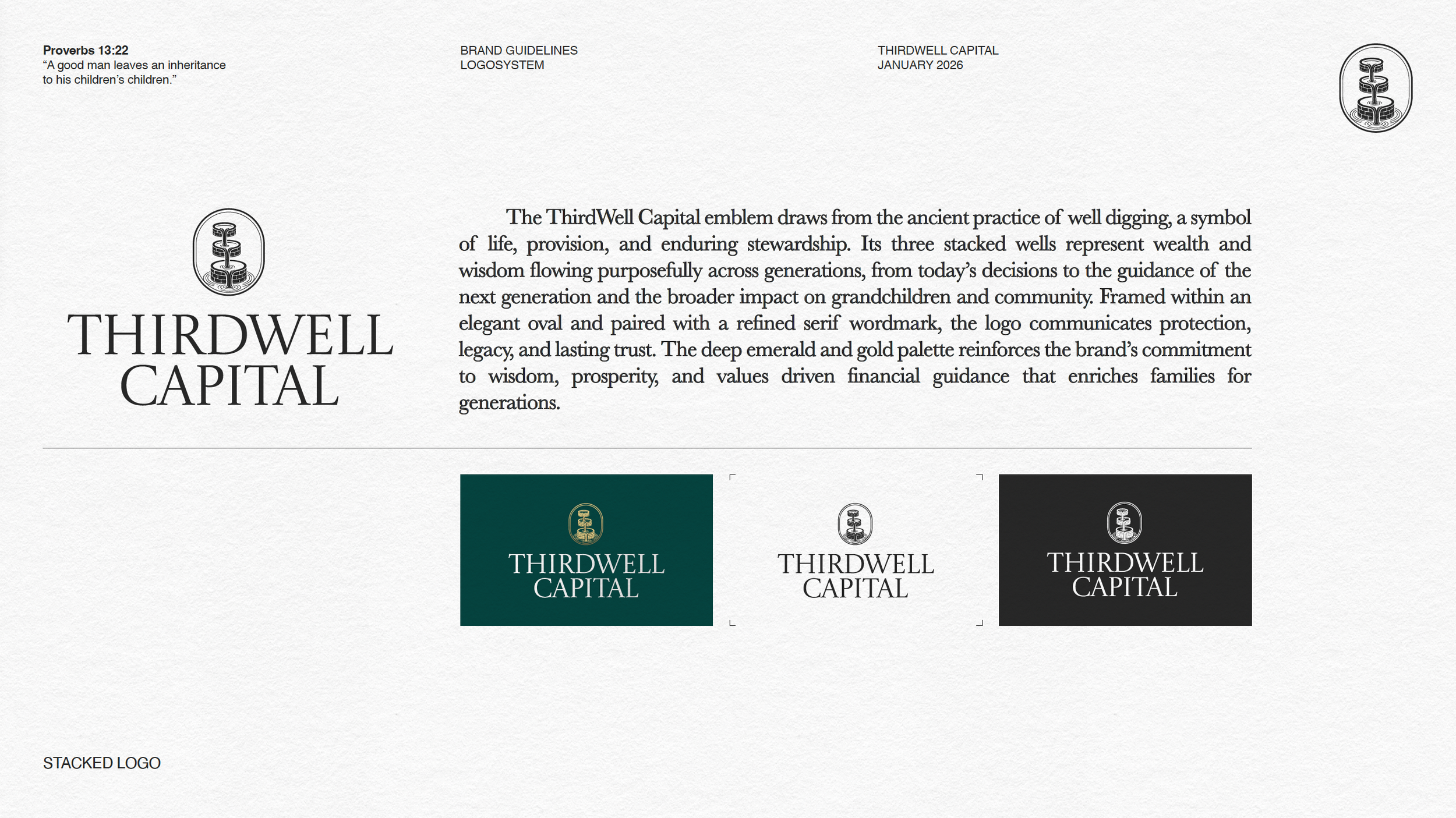
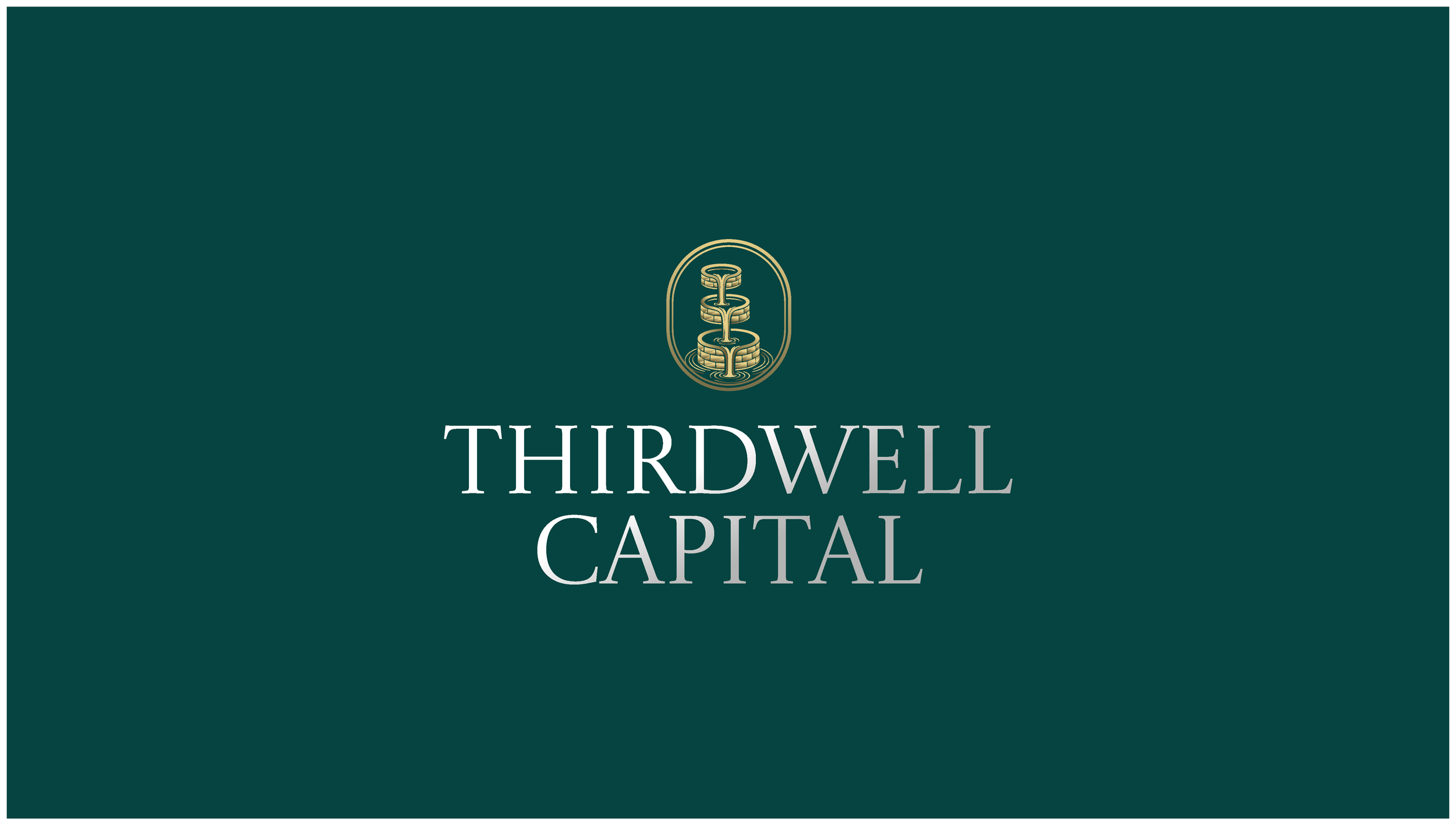
A custom emblem featuring three vertically stacked wells, symbolizing the flow of wisdom and wealth across generations—today, tomorrow, and beyond. Paired with a refined serif word mark, the mark communicates protection, intentionality, and permanenceColor Palette
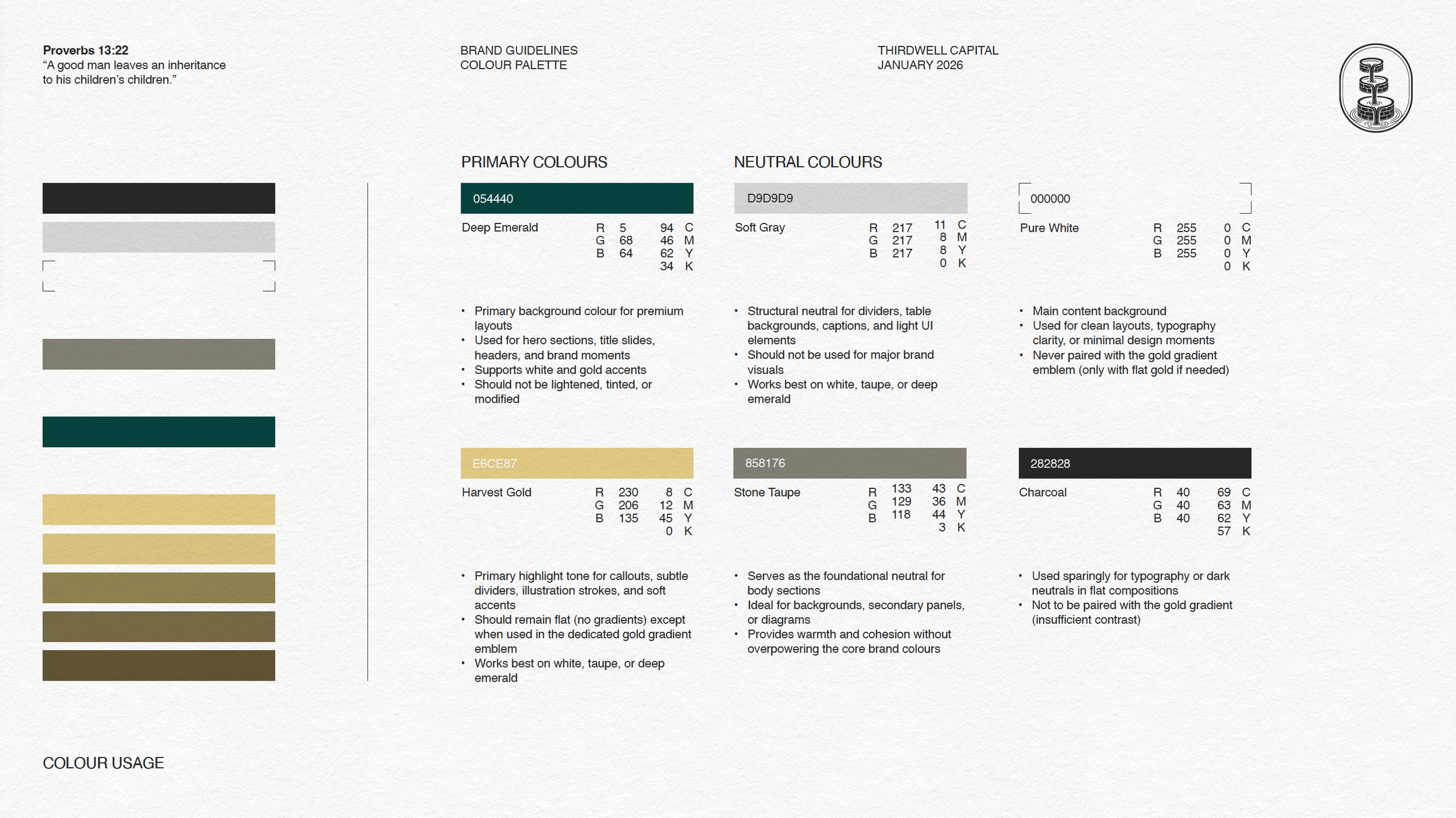
A disciplined palette built around deep emerald, heritage neutrals, and restrained gold accents. The tones evoke trust, growth, and stewardship while remaining calm and understated. A dedicated gold gradient was reserved exclusively for premium emblem applications to preserve its sense of valueTypography System
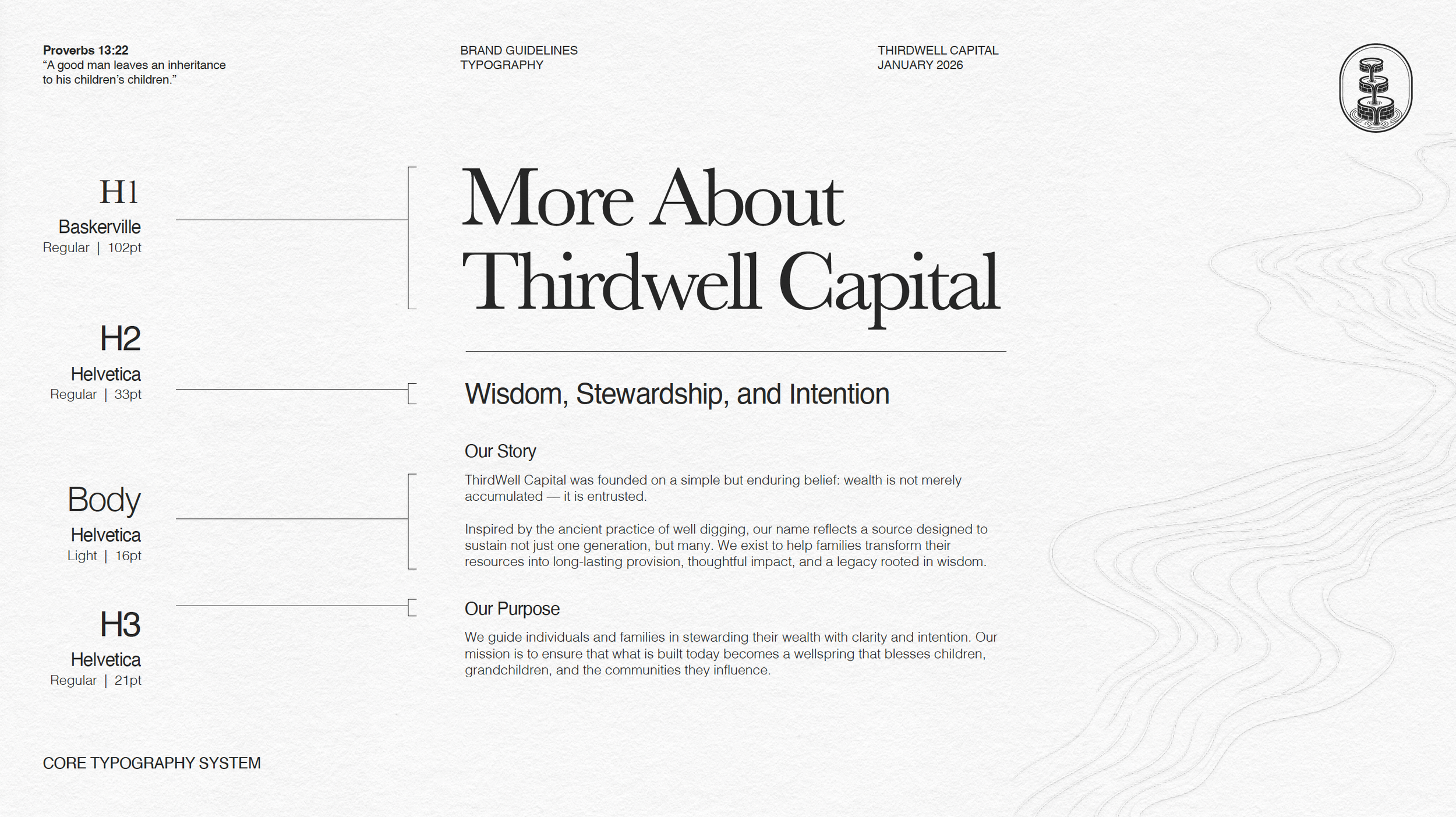
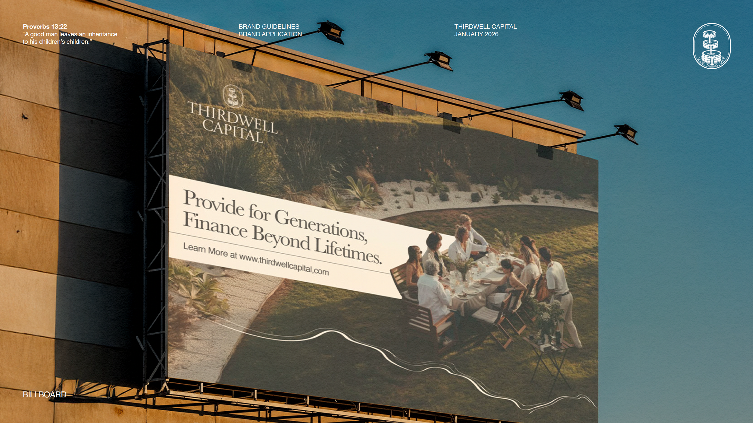
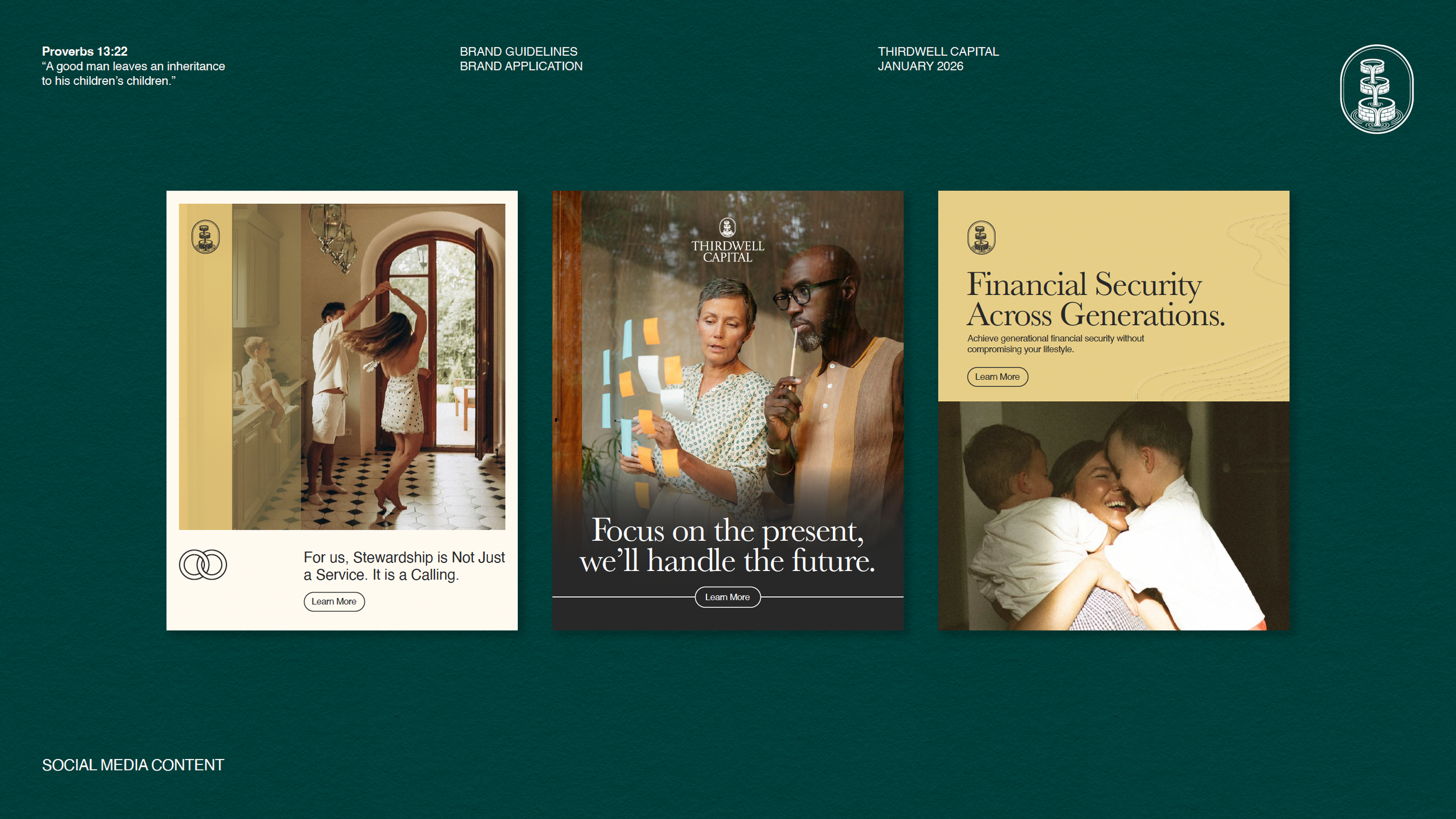
A dual-system approach pairing Baskerville (heritage, gravitas) with Helvetica (clarity, modernity). This balance allows the brand to move seamlessly between ceremonial storytelling moments and functional, information-dense communicationsPhotography & Imagery Direction
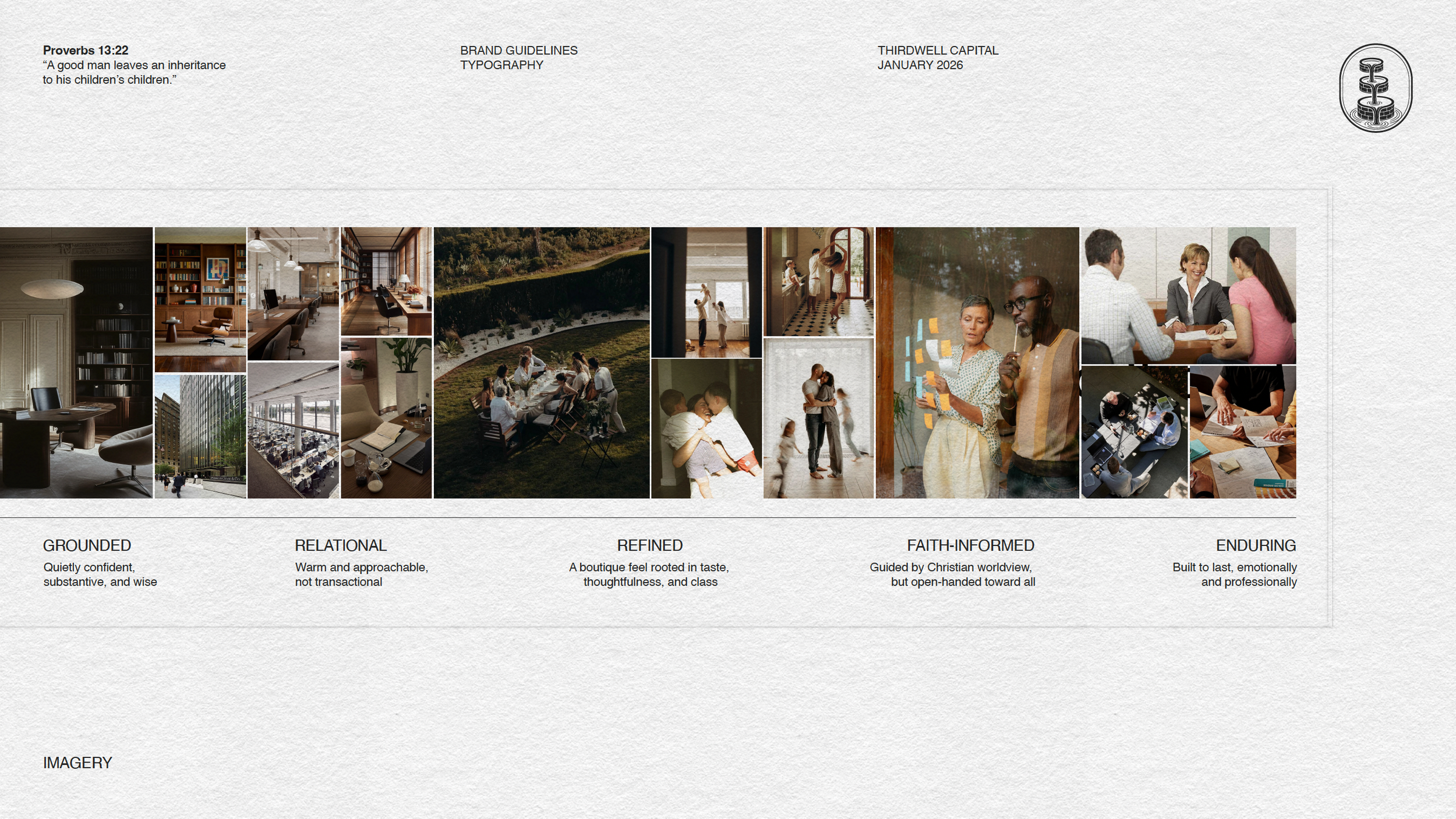
Guidelines emphasizing warmth, realism, and relational authenticity—favoring lived-in environments and genuine human connection over staged perfectionDesign Elements & Iconography
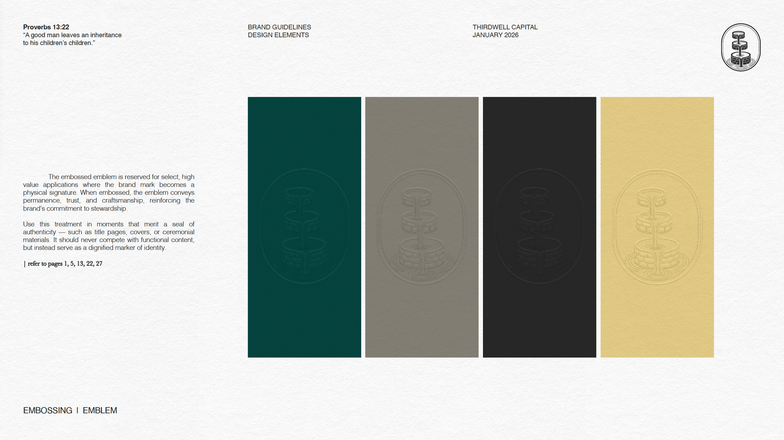
Custom linework, embossing motifs, framing systems, and icon sets that subtly reinforce themes of flow, structure, and continuity without visual noise
Every element was documented in a detailed brand guidelines system to ensure long-term consistency and confident execution by internal teams and external partners alike.
Our Results
The result is a brand that feels established, thoughtful, and enduring from day one.
ThirdWell Capital now has a cohesive identity system that:
Clearly communicates its values of stewardship, legacy, and wisdom
Differentiates the firm from transactional, performance-only financial brands
Scales effortlessly across digital, print, and environmental applications
Provides a strong foundation for future growth, messaging, and client trust
Most importantly, the brand does what ThirdWell Capital itself promises to do: carry meaning forward across generations—confidently, intentionally, and with care.